Natural
Light changes the mood, so a good rule of thumb is to aim for bright, even, natural light in our spaces
If natural light is not possible, use soft lighting or reflectors when necessary
Use dramatic lighting only when it enhances products’ natural shapes and textures


Authentic
Create or capture a space that feels real but inspiring
Embrace existing architecture and avoid spaces with distracting architectural elements
Personal details create realness without distraction while perfection through staging or retouching feels contrived


Balanced
Reduce spaces to the essentials and minimize the amount of product in the space
Use realistic and raw styling to maintain a balance between realness and craft
Find angles and composition that enhance line, celebrate furniture or architectural lines, and find balance in colors and shapes


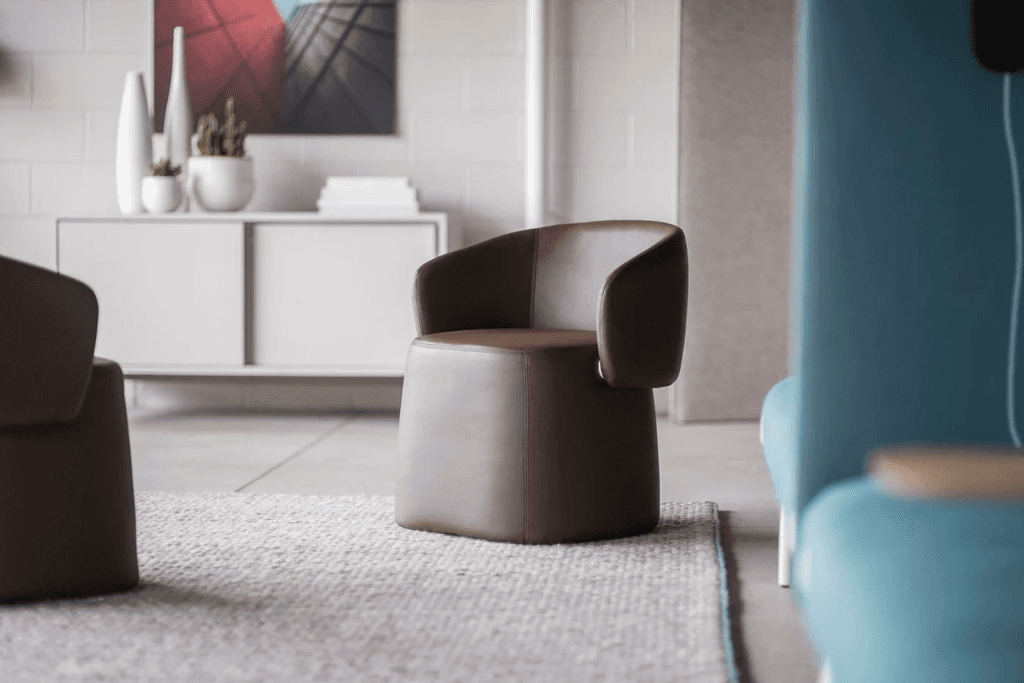

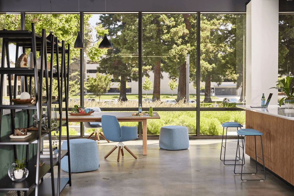
Spaces
Respect natural colors and textures
Avoid distorted lenses and forced angles
Frontal views are usually the most flattering to spaces
Avoid overheads unless trying to show an entire space or graphic detail shot
Minimize distractions by moving product and styling for optimal shot


People
Help people look relaxed —capture realistic talent configurations and inspiring, real moments with natural facial expressions
Ensure product fits talent correctly and reflects a realistic usage of product with natural posture, not overly posed
Always cast people who can be used in videos and not just still imagery
Approach photo shoots in the same way you would shoot a film-considering the framing and narrative of each shot
Diversity should be reflected in race, age, and gender


Product
Play with composition using foreground and background
Don't overstress the depth of field
Show details that give you a sense of the materiality
Curate more editorial shots when possible
Shoot at eye level unless capturing more graphic shots


Styling
Play with composition using foreground and background
Don't overstress the depth of field
Show details that give you a sense of the materiality
Curate more editorial shots when possible
Shoot at eye level unless capturing more graphic shots
People



Space


On-Screen Text
Use either Cream Tint or Petrol Black for text and graphics, and keep consistent for entirety of video
Solid backgrounds are Petrol Black or Cream Tint
Avoid long sentences and paragraphs of text
Use fade in/fade out transitions
Logos
The logo is placed in the center third of the screen, sized at 48 pt height
Videos should start and/or end with a Haworth logo
A background is required once—a white, Cream Tint, or Petrol logo overlay is acceptable for one use if the logo appears at both the beginning and end
Do not use logo with registered trademark symbol
White logo can be used on Petrol Black for emotive brand videos only

Logo without registered trademark symbol is centered and sized at 48pt height.
Titles
Center the text within the screen
Titles appear at beginning of video over footage or solid background consistent with logo treatment
Titles are set in Founders Grotesk XCond Bold in 160 pt text and 144 pt leading
Sub text is set in Founders Grotesk Regular in 62 pt text and 120 pt leading under title

Uniform sizing, font selections, placement, and color reinforce the Haworth brand and creates consistency across our videos.
Lower Thirds
Use 96 pt margin
Left-align text
Place text in the bottom left or bottom right corner
Names are set in Founders Grotesk Medium in 60 pt text
Identifiers, such as titles, are set in Founders Grotesk Regular in 40 pt text and 62 pt leading under the name
Avoid text running into the center third of the screen— if an identifier is long, break into two lines

Our lower thirds are understated, balanced, and refined.
Call to Action
Center the text within the screen
The call to action should appear at the end of the video and fade right before the Haworth logo
Use the same color combination as the logo treatment
Call to action is set in Founders Grotesk Regular at 40 pt text size
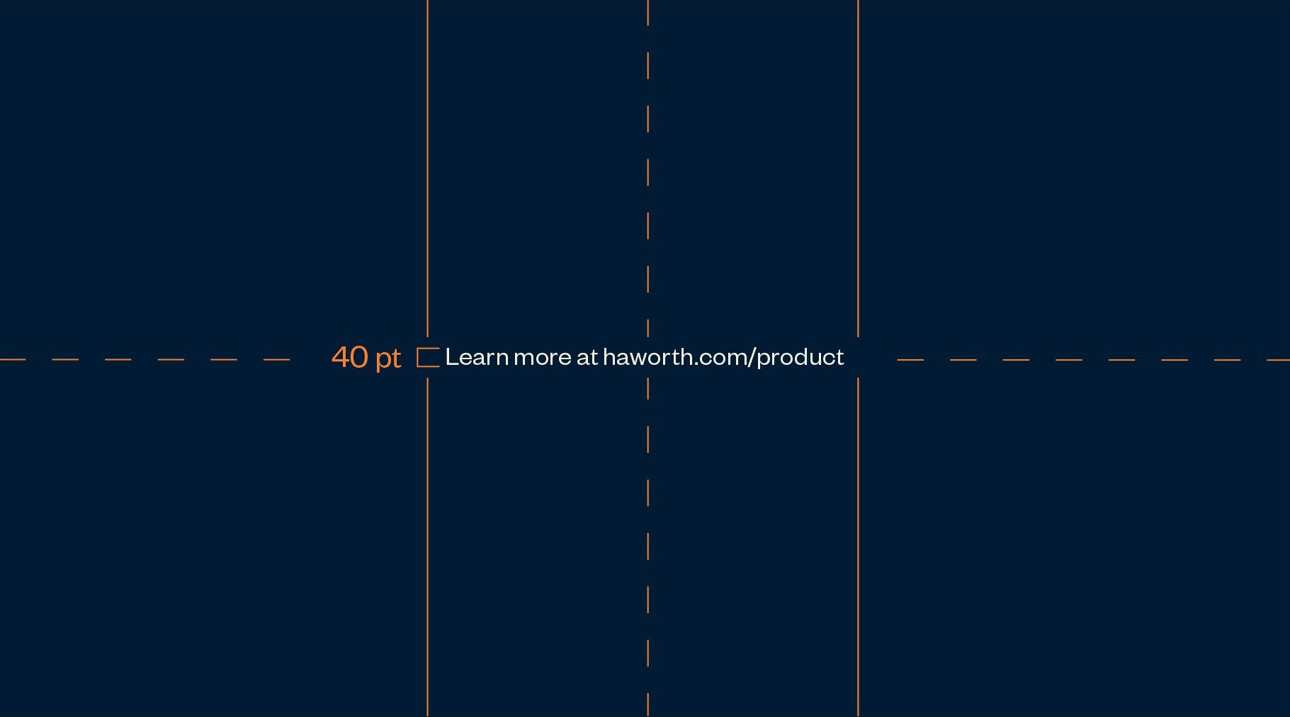
Call to action statements are short with clear direction.